
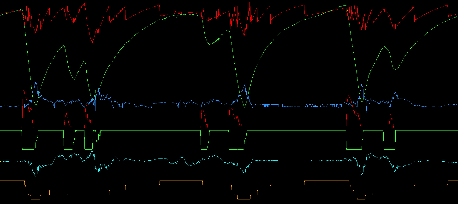
In modern motorsport, telemetry and data acquisition have stopped being a nice-to-have and become a necessity.
Together, these tools turn every lap on track into objective information for decision-making — whether it’s finding the ideal setup, developing a driver, or defining race strategy.
For those just starting out, interpreting a telemetry channel can feel intimidating. After all, these are graphs with multiple lines that need to be turned into concrete answers.
In this article, we’ll walk through the main channels, explain how to read them efficiently, and show how to cross-reference information to get valuable insights.
1. Why is telemetry essential in motorsport?
Before getting into interpretation, it’s important to understand why this tool is so valued. Telemetry and data acquisition serve two fundamental purposes:
Turning feelings into numbers What the driver feels behind the wheel is often subjective. With data, we can confirm — or disprove — those perceptions.
Building a basis for comparison It becomes possible to analyze different laps, compare drivers or setups, and identify where gains and losses are happening.
In top-tier Brazilian categories — such as Stock Car SNG (from 2025 onward), GT3, and Endurance Brasil prototypes — onboard telemetry is a constant ally. In others, even without real-time telemetry, data acquired via the logger already provides enough material for high-level analysis.
Real example: A driver reports that the car “pushes wide” in a high-speed corner. With telemetry and/or data analysis, we can check the steering angle, throttle and damper position, tire pressures and temperatures, among other parameters, to understand whether it’s really understeer or something else.
2. Main channels and how to interpret them
To interpret telemetry effectively, you need to understand what each channel represents and what it reveals about the car and driver.
Speed
- What it shows: Speed gain and loss throughout the circuit.
- What to look for: Peak speeds on straights, minimum speed in corners, and transitions between acceleration and braking.
- Application: Identifying corners where the driver carries more speed without losing it on exit, or where time is lost through excessive caution.
The speed channel shows how the car accelerates and decelerates around the track. A smooth graph, with well-defined peaks and valleys, usually indicates a consistent driver. Abrupt drops and slow recoveries, on the other hand, can point to driving errors or mechanical issues.
In the image below, you can see well-defined peaks at the transition from throttle to brake (maximum speed before braking), and the opposite as well (corner exit). Each peak marks the end of a straight, just as each valley marks a corner.
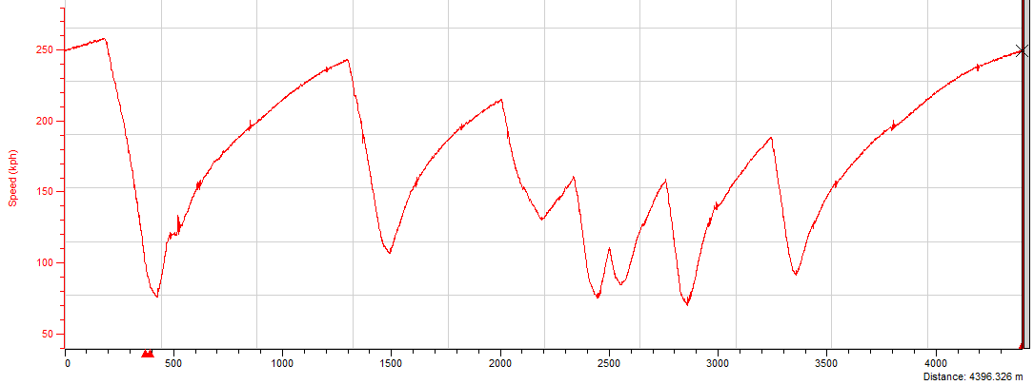
Telemetry graph showing the speed channel.
Practical tip: If the minimum corner speed is lower than the reference driver’s, it’s a sign that corner entry is conservative and/or braking was too prolonged. If you know your driver really was at the limit, the lower speed points to reduced grip, whether from tire wear or track conditions.
Throttle position
- What it shows: How much power the driver is requesting from the car.
- What to look for: Progressive application indicates control or hesitation.
- Application: Evaluating corner exits, detecting progressiveness, and identifying decreasing throttle trends.
This channel shows how the driver is applying power to the car. A graph showing gradual acceleration is desirable in low-grip corners and/or high-powered cars. If the graph looks like an on/off switch, it may indicate the driver waited too long to get on the throttle and then applied it all at once, or that the car has more grip than the power demands, meaning the pedal doesn’t need to be modulated on corner exit.

Speed channel showing that some corner exits are more progressive than others. The lower the gear, the more progressive the throttle tends to be.
Common mistake: Beginner drivers often get on the throttle too early or too abruptly, causing a loss of traction and forcing them to back off the pedal. Throttle position should never decrease on corner exit. At most, it can stay constant for a brief period.
Brake pressure
- What it shows: Braking intensity and duration.
- What to look for: Consistent braking indicates confidence; unstable peaks can signal lock-ups or hesitation.
- Application: Finding ideal braking points, analyzing modulation, and deceleration efficiency.
This channel lets you analyze where the driver starts braking, the intensity of the braking, and whether there’s modulation or lock-up. Good use of the brake shows up as a smooth, consistent downward curve.

The brake pressure channel usually takes the shape of a triangle, with a maximum value right at the start and a steady decrease, when braking is close to ideal.
Steering
- What it shows: Steering angle and corrections.
- What to look for: Smooth movements indicate a clean line; frequent corrections suggest instability or driving errors.
- Application: Detecting understeer, oversteer, or inconsistent lines.

Steering channel showing that the first corner was within the tires’ grip limit, while the second (the first negative region of the graph) was close to the grip limit due to the amount of oscillation.
Cross-referencing with other channels: If the steering angle is near the maximum for that corner and the throttle is increasing or near maximum, the car is understeering. If instead there are steering corrections — sometimes even turning toward the opposite direction of the corner — combined with throttle lift, the car is oversteering.
3. Integrated reading: the real power of data analysis
Looking at isolated channels helps, but the real gain comes from integrated analysis. By overlaying speed, brake, and throttle, for example, we can:
- Detect whether the driver is releasing the brake too late and hurting corner rotation
- Check whether the return to throttle is being held back by rear-end instability
Exercise: Try overlaying the speed, brake, and steering channels from two different laps. You’ll see how small variations impact overall lap time.
4. Free and professional tools for analysis
You don’t need a full F1-level package to get started. Options range from free tools to top-tier professional software:
- AIM Race Studio — Free and popular, great for beginners. It’s the most widely used software in karting, motorcycles, and track days.
- MoTeC i2 — Used across many vehicles for how easy it is to acquire and configure the hardware. Currently used in Stock Car SNG and some Endurance Brasil cars.
- Pi Toolbox (Cosworth) — Standard in the Porsche 911 GT3 Cup/R and the former Stock Car system used until 2024.
- Bosch WinDarab — Used in most modern GT3 cars (except Porsche).
- WinTax (Magneti Marelli) — Used in F4 Brazil and Endurance Brasil’s Ligier prototypes.
- Simulators (iRacing, Assetto Corsa) — Allow exporting to MoTeC i2. In the future, iRacing plans to use Pi Toolbox as its official data analysis tool.
5. Common mistakes when interpreting telemetry
- Focusing only on total lap time — it’s the sector delta that reveals where gains are possible.
- Analyzing data from different conditions as if they were equal — fuel load, tires, and temperature need to be standardized.
- Ignoring driver feedback — data shows what happened; the driver explains why.
- Fixating on a single isolated channel — always cross-reference information to confirm hypotheses.
Conclusion
Interpreting telemetry is more than just “reading graphs.” It’s about understanding how car and driver interact and turning that into concrete actions. By mastering this skill, you stop relying only on subjective perception and start working with objective information capable of transforming performance.
Whether you’re a beginner or a professional, the key is practicing cross-channel reading and looking for patterns to make your analysis faster and more precise over time.


